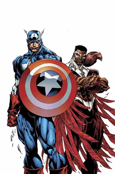
Captain America and the Falcon #1
By Kevin Scott
March 11, 2004 - 11:21
Marvel Comics
Writer(s): Priest
Penciller(s): Bart Sears
Colourist(s): Rob Hunter
Cover Artist(s): Bart Sears
 |
Priest has the ability to draw you into a story and get you hooked and once again he got it spot on! From the outset you're intrigue, this is a Captain America he is take charge and take names, but still holds the sense of justice close to his heart. The prelude panels did a good job in conveying an air of covert manoeuvring and sensibility, especially the one with an old friend (who you'll know). The way The Falcon was introduced was classic Priest, an analogy to set an attitude/principle in place. Well, I'm in this till Priest stops writing and if you had any doubts, the ending, damn, the ending must have you wanting answers :)
The art surprised me: this was a different style to Sears work on The Path. The style was different, and yes a little pronounced in places, but I did enjoy it, there was a definite feel of dynamic prowess in his Captain America and Falcon. At the beginning he captured the feeling of a rainy, windy night well and you could see the deceitful nature within the drunk's expressions and mannerisms. Another thing I liked was the panel layout and inclusion of character depictions to break them up. The cover also had the dynamic flair to entice. Extremely good start!
Report Card - A
Related Articles:
Captain America and the Falcon #13 - 14
Captain America and the Falcon #7
Captain America and the Falcon #6
Captain America and the Falcon #5
Captain America and the Falcon #4
Captain America and the Falcon #3
Captain America and the Falcon #2
Captain America and the Falcon #1
