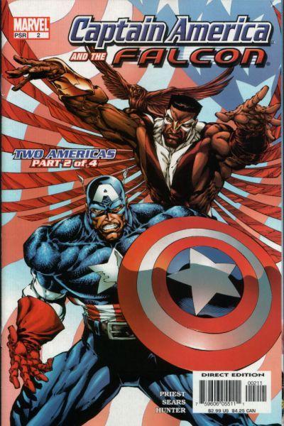
Captain America and the Falcon #2
By Kevin Scott
April 16, 2004 - 10:00
Marvel Comics
Writer(s): Priest
Penciller(s): Bart Sears
Colourist(s): Rob Hunter
Cover Artist(s): Bart Sears
 |
The story is really picking up, but the threads still haven't completed their tapestry. Word is out on the Anti - Cap, but there is still no word of where he came from or who he actually is. It's really great watching how Priest leads you one way and then suddenly, trap door, you're going in another direction. And things are definitely more complex than they seem. Is Leila innocent; is Anti - Cap a villain? Can birds fly without wings???
As with #1, the panel design really helps add a dynamic feel to the book, as well as making things enjoyable to look at. Sears has a really good grasp on emotion and this makes Priests words come to life with vibrancy. The over exaggeration, of the main characters gives them a sense of, power & strength, which is good. The only off putting thing was the size of Wanda and Leila's breasts, which looked out of place, but this was a minor discontentment.
Report Card - B
Related Articles:
Captain America and the Falcon #13 - 14
Captain America and the Falcon #7
Captain America and the Falcon #6
Captain America and the Falcon #5
Captain America and the Falcon #4
Captain America and the Falcon #3
Captain America and the Falcon #2
Captain America and the Falcon #1
