Why Are Comics so great?
By Hervé St-Louis
March 14, 2019 - 20:25
 |
Over a decade ago, I wrote about how one master cartoonist had influenced my two favourite cartoonists and the people In try to emulate the most. I still can't stop marvelling at the depth and beauty of Alex Toth and Hugo Pratt's work. But as recounted in the article, how each diverged from Milton Caniff is an incredible feat of creation.
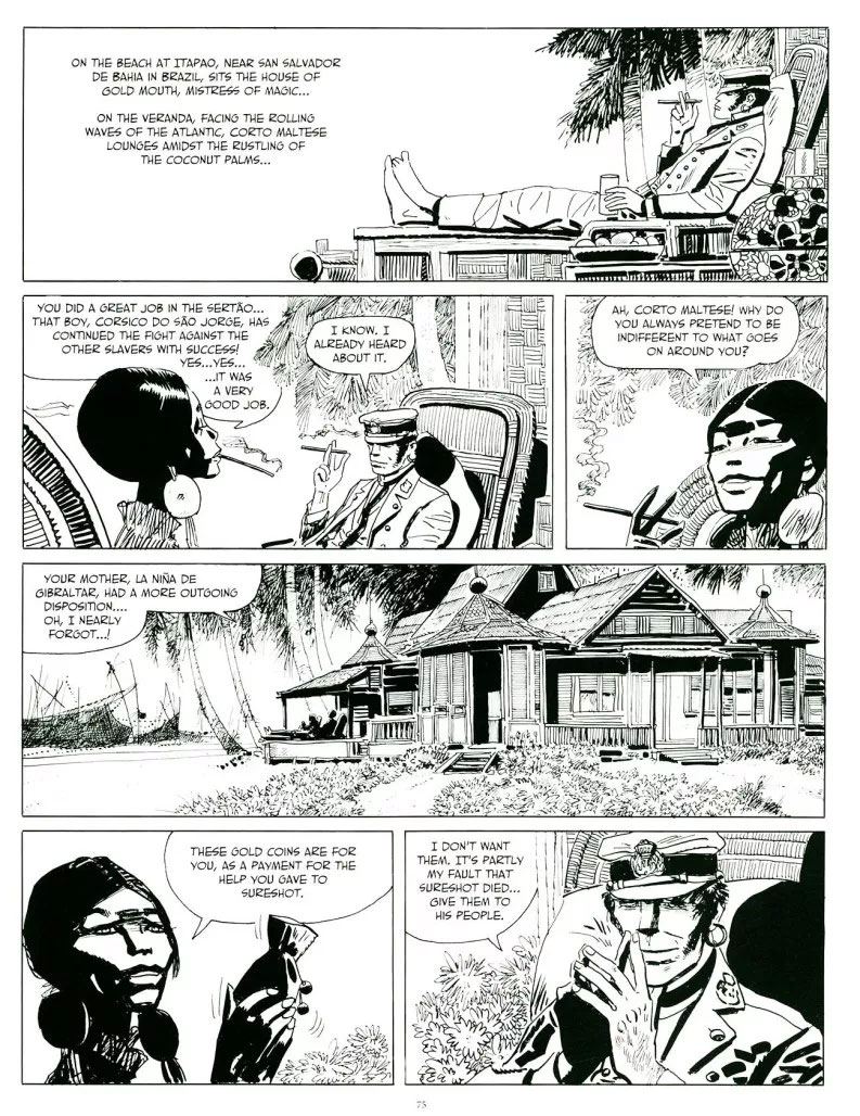
Often people don't understand my fascination for comics. It's hard to explain. In the first pic by Pratt, look at the use of space to create a contrast with the dozing Corto Maltese. The lines are simple, irregular but direct. There is no hesitation and not overuse of sketching. He just draws and fills in part of the space with blacks. The woman next to Corto Maltese is Bouche Dorée. Most of her silhouette is black except for the exposed areas of her face. We can tell that she is a black woman without any caricature or exaggeration. The texture for the beach house elements use basic constructions lines and just a few spot blacks. There is a lot of abstraction in this pic.
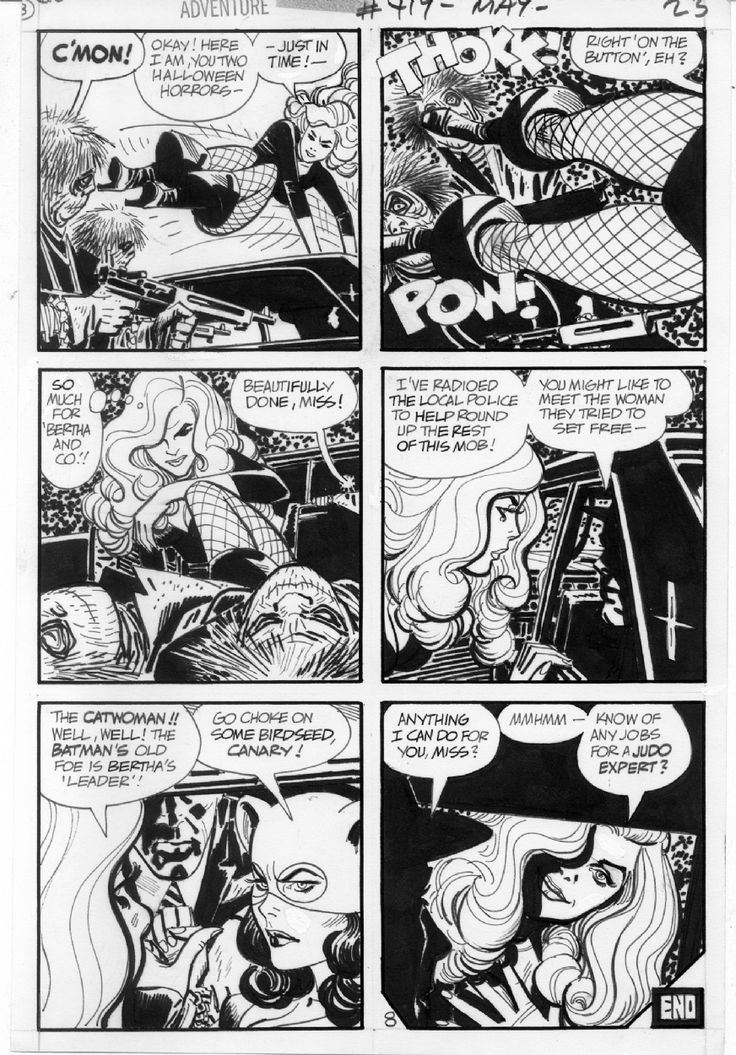
Pratt's Corto Maltese panels have a lot of space to breathe. Toth had to pack in a complex set of events in the space of one page. Although he packs a lot of information, he literally stops himself from creating a claustrophobic experience with his page.
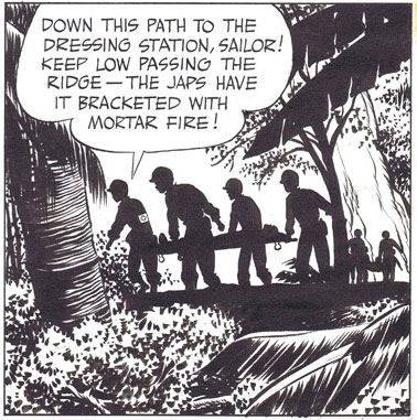 |
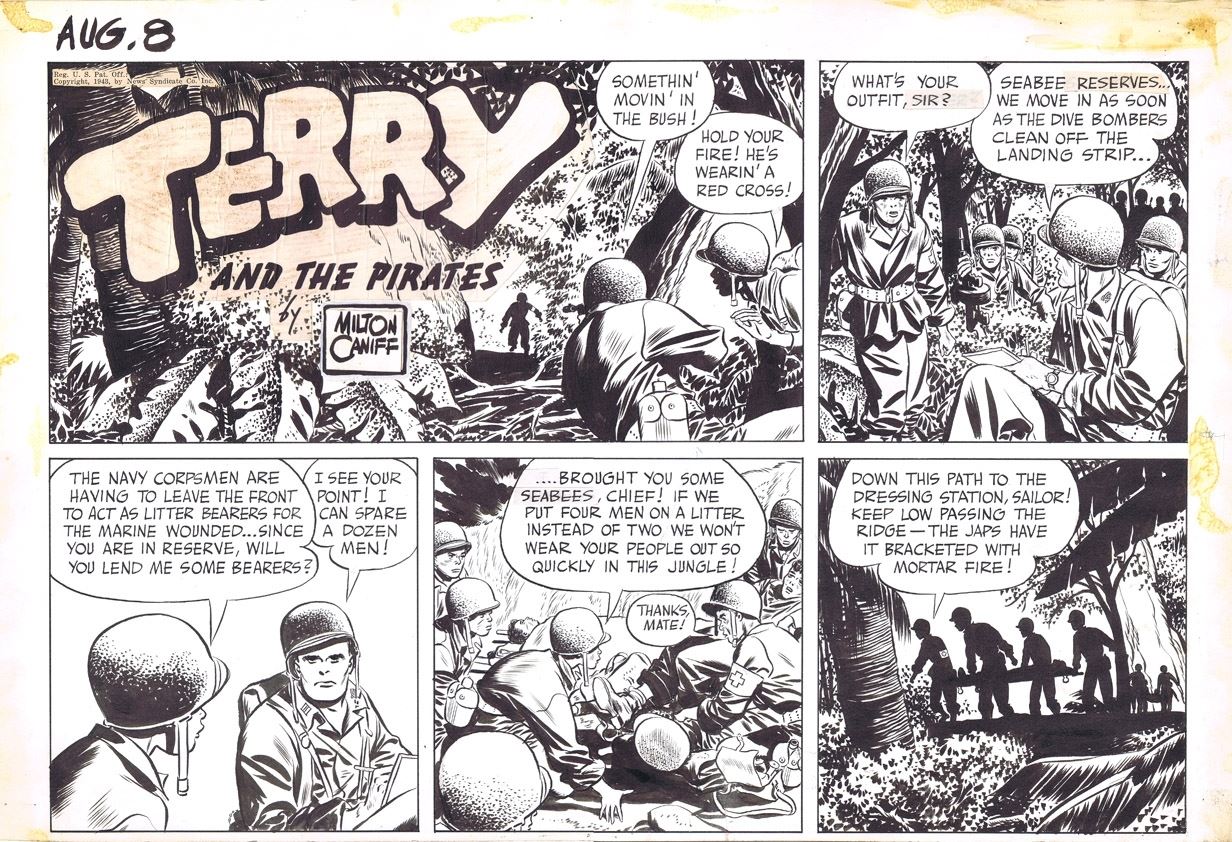
The quality of his lines here seems better than both Pratt and Toth who both favoured shorter strokes. Caniff is able to draw a contour and a shaped line that are strong and long. Yet, they are round and not jagged. He uses the same quality when he spots the shadows on the plants. They are dots with large irregular but pleasing shapes that are so concentrated in one area of the panels' surface that they create mass without necessarily drawing your eyes there, as seen in the last panel.Our eyes, instead are drawn to the silhouettes of the soldiers who are surrounded with just enough white space that we can tell their shape but best what they are up to.
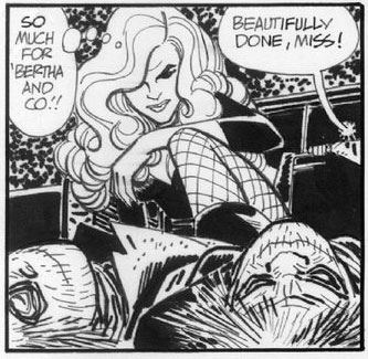
Pratt drew from Caniff by mastering how to use space to create a feel and emotional response in readers. Looking at Corto Maltese, you know that you are supposed to relax and enjoy the breeze that flows from the panel into your mind. However, with Toth, action and going from panel to another matters more. Here, his challenge is tell a compact tale and still make it visually interesting for readers. All of the necessary information is there without the use of an establishing shot. The first panel in the page already creates an anticipation for more. We know what's about to come next. However, his use of light and dark to create different planes and distance is as sharp as Caniff.
The first article that I wrote about the Alex Toth, Hugo Pratt, and Milton Caniff adds more and hopefully will let you understand as well as this post, why comics are so great and why I can't help but love them, and am desperately trying to do something as great as these masters with Johnny Bullet and now Spit.
Cheers
|
|
Related Articles:
Milton Caniff’s Sons – Alex Toth and Hugo Pratt

