Tintin is for the greats!
By Hervé St-Louis
December 22, 2011 - 00:22
Studios: Columbia
Writer(s): Hergé, Steven Moffat, Edgar Wright, Joe Cornish
Starring: Jamie Bell, Andy Serkis, Daniel Craig, Simon Pegg, Nick Frost
Directed by: Steven Spielberg
Produced by: Steven Spielberg, Kathleen Kennedy, Peter Jackson
Running Time: 1 hour and 41 minutes
Release Date: December 21, 2011
Distributors: Paramount Pictures
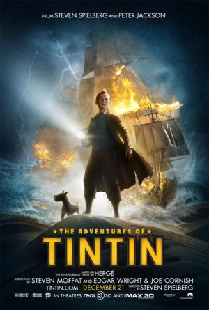 |
Tintin purists and pundits, also known as tintinlogists, will cringe at the merging of the Tintin stories into one to create one story. Fact is the original Secret of the Unicorn took place completely in Belgium and definitely did not have the adventurous feel of the film. By merging parts of the Crab with the Golden Claws, Spielberg introduces the character of Captain Haddock gently for audiences while setting up the epic of the Unicorn and the probable sequel, Red Rackham’s Treasure which is to be directed by Peter Jackson. Since all comic books movie adaptations these take liberties with the actual contents taken from the comic books I heartily forgive Spielberg and the writers of this film for the liberties they have taken. Having read a lot of Tintin material years ago as a kid, I will admit that I was confused about specific scenes expecting plot twists that did not come by and that were changed. It’s eerie. I know the Tintin material so well, it’s like I memorized it through rote learning as a kid. I will say this, Spielberg achieved a Robert Palmer with this film by being able to merge two different stories into one, making it almost seamless. It felt like listening to Mercy Mercy Me / I Want You, the old Marvin Gaye cover from Palmer. It just worked.
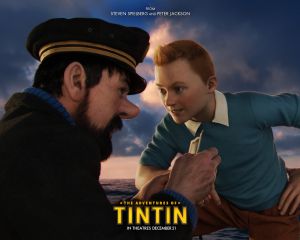 |
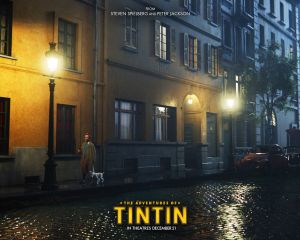
The story is breath-taking and never stops. From the moment Tintin is walking in that fair in Belgium and that Snowy, his faithful dog sniffs the pick pocket; the action just goes on and on non-stop. At one point some of the roller-coaster did get way too crazy. The scene in the market in Morocco where Tintin, Showy and Captain Haddock are chasing an eagle through the streets of a crowded city are just too crazy and almost broke the barrier of believability the film worked so hard to establish. The characters, especially Tintin just keep roaring ahead, as if carried by waves of fervour and passion and never look back. This is not a film about introspection and character development. Tintin is an adventurer and that’s it. He does make a few criticisms about Haddock’s alcoholism but it’s so brief and quick, that it’s almost forgotten. Tintin was always given to short bursts of anger, and the film captured that as well.
 |
Some of the things that did annoy me about this film is the Britishisation of the Belgian origins of Tintin. Haddock was not a Scot. Tintin is not from England. The imaginative qualities of the work in Tintin is purely Belgian and influenced heavily by Belgian world views, which are inherently different than those of the British. For example, for Belgians, it is normal to sail the world over and treat every other country as if it was in your own backyard. For example, the scene involving the local European lieutenant in Morocco had an elitist European flavour that the British just don’t have. The Lieutenant is the leader of a military outpost and his top assistants are all white men. Tintin and his exchange thanks as equals. Tintin never addresses the local Moroccan tribesmen. If this were a British outpost, it would have been heavily staffed by natives. The whole subplots with the Captain’s family estates were played as if they were of British origins, instead of Belgian. I didn’t like the complete translation of many of the names. The only one that survived was in the form of a cameo and tribute about the newspaper that originally published Tintin’s comic strips – Le Petit XXième.
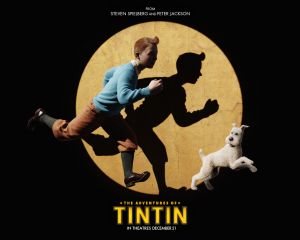 |
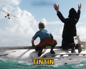
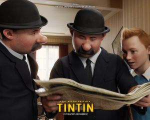
The character design work done on this film is beyond remarkable. The modellers took a page from the Dick Tracy movie from 1989 and the Sin City and literally adapted the comic book look of the characters into 3D form. The comic book designs were themselves and approximation of real life and an attempt to expose funny character features. By transforming the comic book designs into literal exaggerations, the designs were more than over the top while keeping close tribute to the original comic book. Particularly remarkable was the skin textures of the characters. They really felt alive. Tintin was probably the most difficult character to adapt. His face has always been the blandest in all comic books as he was more a vehicle to move the action forward. Well, here the designers took a risk and decide to give him a real boyish look that at moment make the character look too young to be performing some of the feats attributed to him in the past. At most he looks like he’s 19 years-old. The character designers have completely done away with the round and plump cheekbones of the Tintin and replaced them with svelte and bony features. These facial features remind me a lot of the character designs in the Shrek and Puss’n Boots series of films and I’m not sure if they work for Tintin. One feature which I think was completely well imagined was Tintin’s hair. It’s more of a contemporary haircut, but it works quite well for the character.
 |
The animation was stilt in just a few places. Some of the shots on the camels and in the city did not feel as naturally animated as others. Everything else was incredible and will require several viewings to catch all the details. Hergé has always polished the backgrounds, props and sceneries in his comic book, even if the characters had fairly simplified features. That singular quality was kept in the film. Everything looked real. The 3D movie experience was actually quite poor for this film. It’s one of those films that did not need to be shot in with 3D viewing in mind as it didn’t even take advantage of the feature.
 |
If this film is as popular as I think it will be, the announced trilogy will be great and it might become a very solid film franchise. It’s apparent that Spielberg was having fun playing with all these classic Tintin elements. All the adventure and swashbuckling and pure good versus evil that he likes so much is all here, oozing from all pores. There is a lot of play material here that will entertain more than young boys. It’s highly recommended that you go see this film.
 |
Rating: 9.5/10
|
|
Related Articles:
Tintin chez les wokes
Tintin is the Right Symbol for Belgium Resistance to Terror
Archer and Armstrong Are Tintin and Captain Haddock
Tintin is for the greats!
The Adventures of Tintin Season One
E3 2011 : Tintin - the videogame trailer
The Adventures of Tintin: The Secret of the Unicorn
Could Spider-Man Be… Tintin?
Update to Hergé's Adventures of Tintin!
Hergé's Adventures of TinTin!


