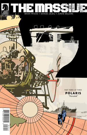
The Massive #12 Review
By Zak Edwards
May 22, 2013 - 20:03
Dark Horse Comics
Writer(s): Brian Wood
Penciller(s): Danijel Zezelj
Colourist(s): Jordie Bellaire
Cover Artist(s): J.P. Leon
$3.50 US
Spoilers Ahead (and a whole lot of gushing)!
I did not expect this to happen, I really didn’t. I figured The Massive the ship and The Massive the comic would never really, actually meet. But here we are, a moment of discovery where the ship meets its seekers, where Brian Wood and co. tell an incredible and moving story that is just not found in any medium that often. The Massive (the series) has been a continual quiet yet powerful story, often placing much of the action of the plot into quick summaries in favour of a more intricate look at both the world and the people who inhabit it. The series is at once beautiful and devastating, and this issue contains absolutely everything of what makes The Massive incredible, and the “Polaris” arc dovetails into a thing of beauty.
 |
The art is poetic, it is simply that, and you can tell Danijel Zezelj has paneled with poetry in mind. There are spaces, full stops, ‘commas,’ and other moments in this piece that work in a more literal poem than the term ‘poetic’ is usually used for, and it works to the benefit of the entire book. It isn’t a comic waiting to be a film, long since abandoning the ‘widescreen’ movement that still dominates most comics, and is instead coming back to more literary roots. I have to say, I did not expect the series would ever find their titular quest, but this moment I’ve already talked about at length, with Israel alone in the arctic wild, a place where the Earth’s weather manifests so very strongly (and the whiteness of the landscape certainly aids in Danijel Zezelj’ artistic choices), we have a powerful, powerful feeling. Good poetry feels, intrinsically, and people know it when they see it. It isn’t simply angry words, or appeals to the audience’s emotions, good poetry feels within itself, and this moment has that. It doesn’t play to sympathy, it plays to literary conceits, and it is beautiful.
That being said, the art initially threw me off. There’s one panel in particular, with extremely heavy inking and blank expression, where I decided, at least momentarily, that I disliked the art, but it obviously grew on me. Danijel Zezelj’s heavy lines obscure and fade out faces, which makes sense for the environment, but leaves most characters looking either stone-faced or simply unreadable. There are other moments, like in the case of Callum's gun, where a Phillip Bond style of cartoonish exaggeration comes in as well, which is also jarring. But the artwork, perhaps like the story itself, moves in broader strokes, focusing for moments to discuss much larger narratives and, while the art works on this larger scale, zeroing in on single panels can be quite alienating.
Grade: 9.5/10 The best issue thus far and proof of what comics can and are when they want to be.
Related Articles:
The 2014 Top Shelf Massive $3 Sale Launched
Fantagraphics Books Announces "Massive" Gay Manga
The Massive #15 Review
The Massive #14 Review
The Massive #13 Review
The Massive #12 Review
The Massive #11 Review
The Massive #10 Review
The Massive #9 Review
The Massive #9 Advance Review
