
Information Architecture, User Experience and Comic Strips
By Hervé St-Louis
February 24, 2015 - 14:50
 |
Definitions
Before I go forward, I will clarify a few terms. Human-computer interaction (HCI) is a discipline that investigates how humans interact with technology. The technology includes computers and related artifacts. Usability and user experience are research areas within HCI. Information architecture is a parallel discipline to HCI that often overlaps. Most people think of information architecture as the organization of information on electronic screens. In this definition, all computers are screen-based. Interactions occur with a graphic interface. The graphic interface is just one of the many ways to interact with computers. We can interact with gesture, voice, or touch. Before the graphic interface there existed other modalities that were anything but graphic.
Usability facilitates human interactions with technology so users can complete tasks, like reading. User experience incorporates usability but pushes towards the congenial experience that surrounds human-computer interactions. Was the experience pleasant while the reader attempted to read a comic book?
Information architecture is more than the organization of icons on a flat screen. Information architecture is from information theory. Information theory is the study of the organization of information in the universe. The opposite of information is entropy. It is order but not organization. Order is a flatline without information. Information architecture like traditional architecture, studies the organization of space. There is spatial organization inside and outside of screens. Comic books, I argue, are also about the organization information in space. This is what I call the information architecture of comic books.
Digital Comics
Developing my first ComicBookBin apps in 2010 made me aware of comics' information architecture. How people read electronic comics differs from how they read print comics. Here are a few more definitions. Digital comics are comics on ebook, smartphone, tablet and local apps. Digital comics exist in tethered devices that users do not always control. People read Web comics through Web browsers. Web comics and digital comics are almost the same but differ in some ways. Browsers rely on generative devices that users control.
Most people creating Web and digital comics these days do not optimize them. Digital comics producers replicate the rectangular layout of print comics for tablets and phones. Many comics from publishers like DC and Marvel Comics are non-altered print comics. For older comics, it is a viable course of action. Not so for newer comics. Publishers who do not adapt new comics are lazy, uncreative and risk-adverse.
App-makers like Comixology tell comics publishers to reuse print comics for their digital projects. Comic readers, of course, do enjoy digital comics in spite of their non-optimized format. For example, reading the text of a digital comic is difficult. Users can adjust distances when reading a print comic. It is more complicated for digital comics readers to adjust texts and captions. Some apps allow users to zoom in or click text captions to make them bigger. This is an intrusion in the reading performed by readers. Readers should not interrupt their reading to enlarge or swipe one text for another. Turning a page is another form of interaction where an interruption in comics is beneficial.
Web Comics
 |
Other Web comics replicate the vertical page layout of comics with frequent page breaks. The page break is not only something borrowed from print comic books. The structure of comic strips also has page breaks. These breaks are often cliffhangers inviting the reader to return for another adventure later. Here, the break operates as part of comic storytelling. The page break is part of the information architecture of the comics. It also conveys meaning and manipulates readers’ affective reactions.
Web comics creators that reuse the vertical layout of print comics disservice readers. Most users use rectangular computer monitors with a landscape orientation. Portrait orientations limit how readers can interact with their Web comics. Web comics are not digital comics. Readers of digital comics can flip screens from landscape to portrait to ease reading. It is true that users can read Web comics in both tablets and with desktops and laptops. But why annoy a large part of your readership? I receive many comics in Acrobat format to review for ComicBookBin. I tend to skip them because they are usually more trouble than worth the time. They are difficult to read on my large monitors or on my laptop. I usually have to transfer them to a tablet and then, the font is usually illegible. Vertical Web comics have the same limits as the digital comics I deplore.
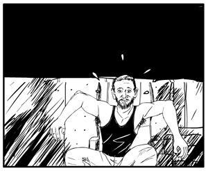
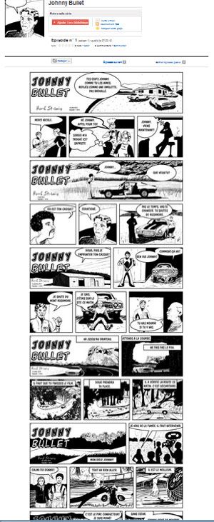
Johnny Bullet to the Rescue
When drawing Johnny Bullet, I use a landscape (horizontal) layout. It is better for desktops, laptops, tablets, and smartphones. Readers can even read the strip in portrait mode because I made sure the font was big enough. The font size on Johnny Bullet is 40 points. 40 points is larger than what appears in a printed comic book. Still, it does not force readers to zoom in just to read the captions. I have tested Johnny Bullet on smaller smartphones with 320 pixels width. It was fine. This has forced me to make other changes. Compare Johnny Bullet to my other Web comic The Specimen. You will notice that the former has less dialogues and text captions. I created the Specimen over ten years ago as a print comic. Because I publish it online, I also increased the font size. Yet, the complexity of the plot necessitates more text. Johnny Bullet, on the other hand, is a breeze to read.
Shorter dialogues mean that the structure of the story is also affected. Johnny Bullet delivers small amounts of information to readers. This is a Web comic after all. How people use information online suggests that dislike long strenuous reads. Few will complain about the how easy and fast reading a page from Johnny Bullet is. Johnny Bullet is an action-based comic strip. I want Johnny Bullet to be as entertaining for me as for the readers. I did not want to deal with layers of subtext and complexity. I want to tell a simple story that most people understand. While the story may seem simple, the architecture of Johnny Bullet is rather complex! Creating usable comics that entertain should be a priority for all comic book creators.
Related Articles:
Web Comics Piracy Is a Thing
Medium as a Web Comics Platform
Webcomics Preview: Grumble #2 Page 10 Rough Sketch
Webcomics Preview: Grumble #2 Page 9 Rough Sketch
Webcomics Preview: Grumble #2 Page 8 Rough Sketch
Webcomics Preview: Grumble #2 Page 7 Rough Sketch
Webcomics Preview: Grumble #2 Page 6 Rough Sketch
Web Comics Wednesday: Atomic Fist Punch
Web Comics Wednesday: Magic Chicks
ComicBookBin Recommends: Webcomics for July 11, 2012