
Astonishing X-Men #34
By Zak Edwards
July 4, 2010 - 14:54
Marvel Comics
Writer(s): Warren Ellis
Penciller(s): Phil Jimenez
Inker(s): Andy Lanning
Colourist(s): Frank D'Armata
Letterer(s): Joe Carmagna
$2.99 US
It seems Ellis has largely lost interest with what is going on in the regular Astonishing X-Men and is probably having a better and more successful time with the Xenogenesis mini-series, which is not only dealing with problems of greater interest than this regular series, but is telling stories with more style and flair (and looks cooler too, but that isn’t really a slight against artist Phil Jimenez). This issue has a general feel of indifference on the writing half while Jimenez’s art, which is labeled somewhat curiously, along with Andy Lanning, as ‘Breakdowns’ and ‘Finishes,’ respectively, contains many of the qualities the writing seems to be lacking. The book is, unfortunately, lacking the wit, humour, and relevance which made the book so popular in the first place.
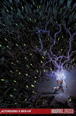 |
As for the art, Phil Jimenez and Andy Lanning, coupled with Frank D’Armata’s colouring, has an attention to detail and high quality almost in direct proportion to the writing’s opposing qualities. Every panel, be it a large splash page with plenty of action and elaborate backgrounds or a single small panel of dialogue, has an attention to detail which has an obvious extra effort put in, despite the strange way the credits are arranged. Jimenez and co.’s more realistic style, coupled with the outrageous elements of the story, like giant were-pterodactyls and giant “What if Willy Wonka was an underground genetic pervert” (possibly the only good line in the entire issue) laboratories, is a great combination striking right at the heart of escapism the genre attempts to capture. Special mentions have to go to D’Armata, whose colours are simply amazing, especially with background psychedelic colours during the bigger action sequences, which has a flair to it I found particularly enjoyable and well done. The colouring is also very detailed to match the art, something else which is immediately noticeable. While the story leaves more than something to be desired, the art is the complete opposite, I almost wish the speech balloons weren’t present!
Grade: C Not worse only because of the art.
Related Articles:
Astonishing X-Men Cyclops
Review: X-Men God Loves, Man Kills Extended Cut
X-Men Dark Phoenix – the Rebirth of a Franchise?
Review: Astonishing X-Men #7
X-Men: Grand Design #1 comics review
Review: X-Men Gold #9
X-Men Gold #2 And The Rebirth of Progressivism at Marvel Comics?!
X-Men Gold #1 and the Death of Progessivism at Marvel Comics
Marvel's X-Men Separate But Equal
Review: Amazing X-Men #8