Comics /
Comics News
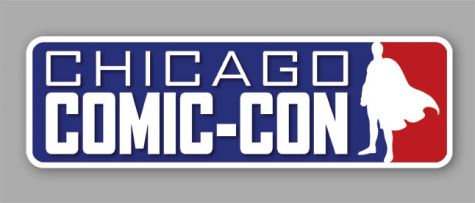
Shelved Chicago Comic-Con Logo Similar To Comic Book Bin's
By Hervé St-Louis
August 23, 2009 - 09:55
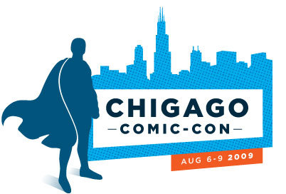
I was very surprised when I saw an old logo for the 2009 Chicago Comic-Con held on August 6-9 that seems to have been replaced by a new version. Wizard World organizes several comic book conventions in several North American cities every year. They have recently rebranded their comic book conventions called Wizard World and replaced them with the generic term Comic-con.
The original logo used for the Chicago Comic-con was a tri-colour logo the type you see in many sports leagues with red and blue to the sides and a white silhouette figure in the center. Their silhouette was a super hero figure.
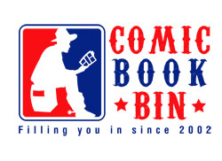
The Comic Book Bin's logo, also using the now iconic tri-colour theme, uses a cowboy instead. And that cowboy is reading a comic book among other things. We do have a test logo with a Superman figure in a tri-colour that we commissioned last year as a sample but we cannot show it here.
The Comic Book Bin tri-colour logo precedes the one used by the Chicago Comic-Con sponsored by Wizard World. When we chose that look, we wanted something that looked different from the usual comic book inspired logos that usually sport some kind of speech bubble and thick lettering. We wanted something that was iconic, yet different. While we could have gone with a tri-colour super hero figure, we chose not to because we thought that would be too obvious. Wizard World changed their logo from the tri-colour to a variation that frankly looks better. The fonts used for the original were ugly.
Last Updated: March 3, 2025 - 20:40


