Comics /
Cult Favorite
Storytellers Weekend, pt. 6 of 8: Borders & Balloons
By Philip Schweier
April 5, 2010 - 20:29
On Feb. 19 and 20, the Savannah College of Art & Design hosted Howard Chaykin and Klaus Janson, who presented a two-day seminar originally conceived for Marvel Comics. The purpose of the seminar is to introduce new comic artists and Marvel editors, some of whom come from an editorial background and lack the experience to effectively judge comic book techniques, to basic tools of effectively telling a story in the comic book form.
 |
| Howard Chaykin |
According to Howard Chaykin, there is a comic book artist who does vignettes that accept the existence of the panel border as part of the picture.
“I think it’s nonsense and bull****,” he says. “The panel border is imposed on you by a printer, not by God. If you use the panel border in the context of the panel, you are stopping the world beyond that panel border, so it exists within its own universe. It’s its own border, it’s own shape. The crop that exists because of the panel border doesn’t exist in the universe of the drawings you’ve made. The panel borders exist from the technical perspective.
“Your job is to create a world where the panel borders don’t exist for the characters in the picture. The panel borders represent us as a prosceneum arch, the same way that tree in the foreground acts a surrogate in a picture.”
Chaykin goes on to say that we, as readers, need surrogates in our pictures. The tree serves as a surrogate, to help point the frame at what we should be looking at. The amateur will always put the important element in the foreground in the middle; the professional will always move the important elements into the middle ground, to the right of center.
“One of the things that Marvel spoke to us about before our last seminar,” says Janson, “they wanted us to emphasize being dynamic because Marvel thinks that their work and their image is one of dynamism, and DC is sedate. But how do you actually do that? What are the mechanics of being dynamic?”
According to Janson, part of the answer is composition, and oftentimes the answer to a lot of the problems comic book artists deal with. “One of the things you have to realize is what you position in panel one is whether it’s compositional or informational, affects your composition in panel two,” he says. “And panel three. And panel four. If we agree with the concept that the page is a unit, everything on that page relates to each other.”
So on a page with five panels, the last panel should relate and take into consideration what an artist has done in the first panel and the second panel and the third and the fourth. “Everything is connected,” Janson emphasizes. “That’s a very critical concept to understand. The containment of that information within a border, whether it’s the page or the panel border, everything within that border is connected.”
Janson explains one reason why drawing comics effectively is so challenging – as opposed to fine arts or illustration – is normally in those mediums artists have one image to deal with. In comics, there are three or four images per page and those images are in a relationship with each other. So each panel has to work on its own and then each page has to work as unit, so that each of those images on the page also works in connection with each other. As soon as you put a border around something, those elements become connected.
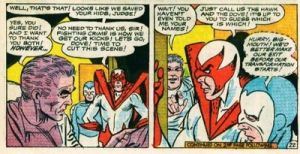
Among those elements, and often overlooked, are word balloons and captions. “I have never in all the years I’ve been teaching been as stunned with the class that I’m teaching now,” says Janson. “They do not understand the placement of balloons and captions. What’s captivating about it is that I take it for granted that it’s second-nature, and it’s not second-nature at all. They’ll put balloons between two heads that are talking to each other. You shouldn’t do that, because what happens is your two characters are looking at the balloons instead of looking at each other.”
The placement of balloons and captions and how they are used can be confusing, and how to exploit that relationship between words and pictures. The relationship between words and pictures is not only in terms of descriptive text and illustration, but also a physical relationship.
“I hate, on a personal basis,” says Chaykin, “balloons that tuck into the edge of the panel because it gives the panel border an importance and attention it doesn’t deserve.” Chaykin instead urges artists to think about using the balloons as an element of the picture.
“I like a balloon that floats, that has air around it,” he says. “It continues to enhance the depth of field that you use to create the picture. The other alternative is to overlap the panel border.”
Next time: History Lessons
Last Updated: March 3, 2025 - 20:40


