Comics /
Cult Favorite
Storytellers Weekend, pt. 5 of 8: Panels & Relationships
By Philip Schweier
March 28, 2010 - 18:00
On Feb. 19 and 20, the Savannah College of Art & Design hosted Howard Chaykin and Klaus Janson, who presented a two-day seminar originally conceived for Marvel Comics. The purpose of the seminar is to introduce new comic artists and Marvel editors, some of whom come from an editorial background and lack the experience to effectively judge comic book techniques, to basic tools of effectively telling a story in the comic book form.
Klaus Janson raised the question of the most common relationship in comics – words and pictures. “We’re talking about a relationship we deal with every day, every time we sit down to draw a page.”
According to both Janson and Howard Chaykin, the artist is ultimately responsible for the success or failure of any given comic book page. “You must, must accept responsibility for that,” explains Janson. “If you do not accept responsibility for that page, you’re defeated even before you begin.”
Every decision a comic book artist makes has meaning. “There is a reason why Howard will pick the establishing shot to be a wide angle panel,” says Janson. “There’s a meaning behind it. There’s a meaning behind why Howard does three workbook panels in a row. Every decision has meaning because it communicates information to the reader, and it’s up to you to make sure that information is correct and has something to do with your intention in terms of storytelling.”
 |
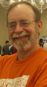
| Walt Simonson |
According to Chaykin, artist Walt Simonson once described comics as illustration with the element of time added. “What he’s talking about is the relationship of event and action to size,” Chaykin explains. “There is a direct relationship between the size of a panel and the action in the panel – which is why the amateur draws little tiny pictures filled with shit, without thinking about that relationship.
Chaykin also comments on how little room for information. “ Know that,” he urges. “Amateur writers think you can get more information on a page than you can possibly imagine. The page is perhaps a minute or two of time.”
Janson goes on to explain that just because two panels are next to each other, their proximity does not automatically guarantee a connection or a relationship. “It’s up to you as artists to connect those two panels, either through your setting or your composition. To me, the composition is everything – everything. And your ability to use composition in terms of clarity and entertainment is critical.”
“With comics you sometimes need a 'background' to enhance what’s going on in the foreground,” adds Chaykin. “I go to the theater fairly often, and one of the things that bothers me about modern audiences is that they give everything a standing ovation, because they think that’s what they’re supposed to do. What they’re actually doing is applauding their own good taste for being there. You cannot have the same level of emotionalism and expect there to be a big bang. You have to have something to compare it to.”
Janson agrees. “You need thick panels and thin panels, you need black and white. You need fast scenes and slow scenes. You need contrast. Without contrast it’s monochromatic, and monochromatic has its place, but its place is not in 21 pages. In 21 pages, a monochromatic approach to story tone can be monotonous.
 |
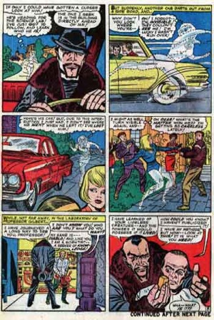
| Comics in the 1960s commonly used a six-panel system |
Janson explained the difference between a grid and a non-grid page. “A grid tells you that all of the information within the panels is equal,” he explained. “If you choose to do a grid, whether it’s four-panel or six-panel or whatever, if all of the panels are the same size, you are saying to the reader that all of the information within those panels is equal.’
Conversely, if an artist decides not to use a grid and do more free-form page layout, it then becomes part of the storytelling. The biggest panel would be either the most informative or the most entertaining or both.
“You are saying that with your choice of layouts, and I’m saying that your choices and your decisions have meaning. It has storytelling information, so don’t dismiss your page layout as meaningless or inconsequential. It has great meaning.”
Next Time: Borders & Balloons
Last Updated: March 3, 2025 - 20:40

