Comics /
Comic Reviews /
Marvel Comics
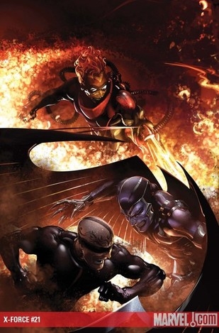
X-Force #21
By Zak Edwards
November 18, 2009 - 12:39
If X-Force has a single problem, it would have to be how the book is continually embroiled in some crossover taking away from the story-line of the book. Once again, X-Force is in the middle of a crossover which relies on the purchasing of other books in order to make sense of what is going on. Luckily, sort of, this issue is basically one long scene saying the exact same thing over and over again, and so catch-up doesn’t really feel that necessary. Unfortunately, the book is repetitive and takes away from the fact X-Force is actually partaking in a crossover which has been developing with the writers of this series for a good long time.
 |
This issue of X-Force has one major flaw, repetition. Plot-wise the whole issue is an ongoing fight on multiple fronts between the continually mystified X-Men and a group of mutants they thought were dead, with brief intermissions to show what the master planners are doing before going straight back into the fighting. But honestly, it took me until page seven before I got tired of the multiple times the phrases “But I thought you were dead!” and “What’s going on?” kept showing up, which was about eleven times each in the comic book, so almost every page between the both of them. This, along with the fairly difficult plot to follow, renders this issue almost unbearable. I understand what’s going on to some degree, but the holes just seem exemplified by the characters telling me they don’t get it either every second page. The fights switch almost page by page, not giving a sense of simultaneity, but a sense of utter bewilderment. Which is unfortunate, as Yost and Kyle’s amoral X-Force has been a source of great enjoyment since it started almost two years ago.
And considering Clayton Crain’s art, which is usually gorgeous, looks as rushed and disjointed as the issue reads. There seems to be instances where the easy way is taken out in many different ways, especially when placed next to some of his very good panels. For example, the page which zooms in on Pyro has a wonderful panel of Pyro in crisp and clear detail, yet in the panel above, fur on characters is depicted by what looks like a whole bunch of squiggle lines. Characters are continually shown with their backs to the camera, or obscured by some sort of object. So, while there are moments in Crain’s art which are simply gorgeous, they lose their effect almost immediately as the panels around it are given haphazard amounts of attention.
4/10 Occasional artistic beauty compromised with rushed efforts and repetition.
Last Updated: January 17, 2025 - 08:20
