Comics /
Comic Reviews /
Marvel Comics
Ultimate Comics: X-Men #2
By Zak Edwards
October 12, 2011 - 20:40
The first issue of Nick Spencer’s Ultimate Comics: X-Men was exciting, something that has been lacking in the Ultimate Marvel Universe for a while now, especially outside the Ultimate Spider-Man series. But in a single issue, Spencer has managed to bring a new status quo and feel to a series that had become a place to rehash old ideas. Even if some of these ideas weren’t actually very new, they felt like it, which can be equally as important. And after such a stellar initial issue, Spencer and artist Paco Medina have a lot to live up to, which probably makes this issue more disappointing than it actually is.
 |
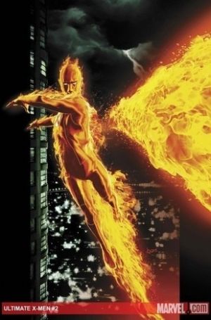
Not to say this issue is an outstanding example of bad comic writing, it has some very strong moments, but many of the aspects that made the first issue so enjoyable and engaging seem to have fallen by the wayside to introduce another group of ideas. The ideas are a natural progression: if the first issue was about the world the X-Men now occupy, the second is about living in such a world. Kitty’s overarching monologue, furthering her continued bitterness to the flawed and deceased Professor Xavier, captures the problematic approaches characters are taking to the new status quo, with just a slight meta-fictional nod to naysayers wishing for the glory days of the title. However, these new ideas, while perfectly matched to the ideological discussions of the first issue, aren’t as well executed. The story focuses more on the rescue of Rogue from Sentinel robots ordered by the government to use lethal force on, um, rogue mutants, rather than characters talking about the world they live in. This may make sense in a book with less talking, but all these characters seem to do is speechify. Spencer has major issues with exposition, the pages become blocks of text with backgrounds of crammed artwork. With so much text, I expected Spencer to explore some themes, but mostly the characters and blocks of text are inefficient uses of space. For example, a character named Elise Cartwright is introduced, given a long history, and killed on the next page. The scene works to establish the desperation and resistive acts of the people against negative societal changes and establishes the villain, but manages to become repetitive in the short span of a couple of pages. The return of the villain, Reverend Stryker, is also disappointing, but Spencer’s thematic concerns make Stryker the necessary villain. Hopefully he becomes more rounded as the story progresses and evolves from a man with lines like “This is God’s will” into something beyond demonizing religion in general. But the comic is still enjoyable and is actually still very exciting because of Spencer’s character work. The dynamic between Bobby Drake (Iceman) and Johnny Storm (The Human Torch) is a s strong as anything Brian Michael Bendis came up with in Ultimate Spider-Man, and the two of them constantly egging each other on is quite funny. Similarly, Kitty Pryde’s take charge attitude and leadership is complicated and flawed while keeping the character interesting and strong. I just hope Spencer returns to and integrates what he promises in the end of the issue’s monologue into a larger narrative that will prove as exciting as his initial issue.
If the artist was someone other than Paco Medina, I think Spencer’s over-exposition would be more detrimental, but Medina’s art continues to be annoying, so covering it up isn’t as bad as it could be. Characters do seem less contorted in their disproportionate bodies as the last issue and the panels are less focused on said ‘portions,’ but Medina’s art isn't enjoyable. The Human Torch and Iceman look identical with a colour swap, making them easy to distinguish but also distracting because of the obvious similarity. And they both seem incapable of expressing emotion, something Medina’s art usually conveys quite easily. I understand Medina is a popular artist and experienced in books like this, but I feel he is still a poor choice.
Grade: B- Not bad, but all of Spencer’s words can’t live up to the last issue (but do a decent job of covering up the art!)
Last Updated: January 17, 2025 - 08:20
