Comics /
Comic Reviews /
DC Comics
Trillium #1 Review
By Zak Edwards
August 8, 2013 - 11:55
Jeff Lemire’s last big project at Vertigo, Sweet Tooth, finished last year, so it is exciting to see him back at the imprint doing some sci-fi work that is much different from Animal Man and his other work for DC proper. Even better, this new project reunites Lemire with almost the entirety of the Sweet Tooth creative team, including colourist Jose Villarrubia and editor Mark Doyle. And while Trillium is very different from Sweet Tooth, having the same team shines through: here is a group that knows how it works and this cohesion is seen throughout Trillium's first issue.
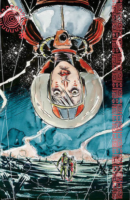
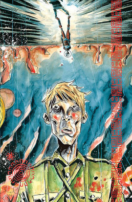
Trillium's debut is a flip book, with the individual stories of how main characters William and Nika come to meet each other. But more than just the covers match: every single page follows an identical panel layout, moving these stories closer than their generic borrowings at first would suggest. Both characters is suffering from trauma, Nika’s loss of her mother and the swiftly dwindling human population and William’s WWI shell shock. The physical experience of these two stories merging, while seemingly gimicky, works to draw these parallels. In particular, it works as a strange resistance to the reading experience, a sort of reclamation of the digital takeover of how we read comics. Here, Lemire has made a something that Comixology will have a hard time reproducing and the traditionalist in me is just excited to see an experiment that shows why and how print media is still important and relevant. The Vertigo advertisements in the issue are boasting a new tagline, “Defy,” and Lemire’s comic defies genres, assumptions, and even digitization with this book. Certainly Vertigo’s announcements during Convention Season were a surprise, being so quiet the years before, and the existence of new projects in general is defying skeptics (
even us here at The Bin), who thought
Karen Berger’s departure foretold the Vertigo’s collapse.
 |
Let’s divide this review along the same lines as the comic and start with Nika’s science fiction story. This half of the issue is unusually talkative for a Lemire comic, filled with personal reports and long bouts of worldbuilding dialogue not very necessary for the colonial setting of the other story. The universe itself has its cliches, but it looks beautiful, very much fitting into Lemire’s usual depiction of sparse yet powerful settings. In particular, the technology is almost retro: the AI charater Essie is a funny sort of delight, worrisome in her overriding power and quirky in her characterization, and Nika’s transport vehicle is a delight, at once futuristic and almost pre-modern, like a retro-future vehicle that someone in William’s 1920’s mindset would envision in the future. But Nika’s encounter with the aliens is at once beautiful and troubling, both in terms of her drugs, but also in her relationship to her past. The drug trip is also simply gorgeous to look at, both double-page spreads are, and Lemire’s quality of art only improves with every project he takes on. So while cliches abound in this story, from aliens and drug trips that strongly connect to the troubling colonial perspective found in William's story, such relationships are surely to find a greater complexity throughout the series simply because Lemire's strengths as a storyteller and worldbuilder will necessitate a more powerful structure.
William’s story is an exercise in a more familiar Lemire and, given the identical panelling of each story, proof that how a story is told is much more than technical, qualitative choices. For Nika’s story, the pages of a more traditional grid are used for world building to show off the AI character and the world she lives in; for William, these panels intercut his traumatic experiences in World War I with his current violences in the Amazon. The dialogue is sparser and pencils rougher compared to Nika’s slight plasticity, drawing on the confusion he feels to explore his own position. For William, he is rougher, wearing his trauma as exhaustion, weariness, against Nika’s anger and frustration. The story relies on visual imagery much more, such as the quick cuts, and uses the space to explore characters and settings more than build them. The world he inhabits, while more familiar, is similarly alien: the stereotypical native population draws strong parallels to the aliens in Nika’s story, but the viewpoint of the British colonizers is swiftly condemned by Lemire’s writing. Such a balance really does ‘defy’ the genres Lemire is working with and, despite the aliens being uncomfortably blue and
Avatar-esque in their construction, I have much more confidence in Lemire than James Cameron to explore these tensions in a much more productive and interesting way.
Grade: 9.5/10 Beautiful, some of Jeff Lemire’s most accomplished work and we’re only at the first issue!
Want my thoughts condensed into 140 characters or less? Follow me on Twitter @ZakEdwardsLive
Last Updated: January 17, 2025 - 08:20

