Comics /
Comic Reviews /
More Comics
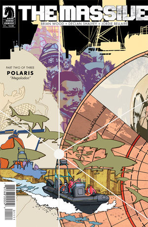
The Massive #11 Review
By Zak Edwards
April 22, 2013 - 19:00
The Eisner Award nominations were a big upset this year, almost completely ignoring DC Comics and heavily favouring the creator-owned work on publishers like Image Comics and Dark Horse Comics. Dark Horse got seven nominations and, much to my surprise, Brian Wood’s The Massive represents only one of those. Mind you, Dave Stewart’s nomination for Best Colourist is more than warranted, both on this series and the many others he contributed to last year, but the writing and other artistic elements in this series are more than worthy of nomination. Of course, this has always been one of the Eisner Awards’ biggest criticisms, it does tend to leave things out.
 |
This issue follows the series’ swift rise in action and character focus that has dominated this year’s issues as Wood brings a more focused story. This issue, like the previous, juxtaposes the post-apocalyptic world with the story, this time with a meditation on sharks with the impact of Callum’s cancer on the remaining crew. Callum himself is barely featured, but his few actions are telling for both how he is coping and how the crew is working since many departed last issue. Callum remains a confusing protagonist in the best ways possible: his decisions elicit empathy while being generally poor and this issue has drastic results for at least one member. If people are approaching this issue with any sort of realist expectations, it won’t hold up, but in terms of symbol and progression, it makes perfect sense and is actually a quite thought-provoking 22 pages. Like the world they inhabit, the story is somber, sparse, and, similar to the sharks featured throughout, full of dangerous potential. Not that this story is going to explode anytime soon, but it will certainly remain fascinating. The sharks themselves serve as a great counterpoint to the survival of the crew and the looming dangers. The emphasis on the just below the surface threat they pose, only to have them come above for one beautiful and terrifying panel, juxtaposes well with Callum's poor decision making. Of course, the dive down to the terrifyingly massive megalodon is an intriguing scenario, the presence of an extinct species after a global catastrophe certainly adds a moment of hope, not only because the animal doesn't react, but also because its almost zombie-like appearance contrasts the promise it represents. The sharks offer a point of resistance, but within this resistance, they appear near-dead and ultimately dependent.
The artistic team has made a noticeable change this issue and feels the same while being slightly off. The house-style, as it were, remains: sparse landscapes, subdued colouring, straight-forward panelling, and thus remains fairly coherent. Sometimes art changes can jar readers and confuse, but here there is enough consistency that the focus remains on the story. Colourist Jordie Bellaire adds some stark colours every so often, which accentuates nicely, but Declan Shalvey’s waterscapes steal the show, like watching a documentary that simply couldn’t happen. And the ominous dead-eyed monster looms with such silent force. The story is brilliantly rendered.
Grade: 8/10 Wonderful story, amazing art, start reading!
Last Updated: January 17, 2025 - 08:20
