Comics /
Comic Reviews /
DC Comics
The Flash #1
By Garth the Geek
September 29, 2011 - 19:28
I had to read this comic twice to decide how I felt about it.
The first half reads like something out of the 1980s, back when things were a lot more innocent and fun. It lacks the darkness that has crept into comics over the past few decades. Because that’s what everyone wants, right? Dark, brooding characters?
But not here. Rather than being feared or mistrusted, the Flash is loved and respected. When there’s a possibility that he may have inadvertently killed a man, the police department actually attempts to quell any rumours until they can prove otherwise. And the Flash’s alter-ego, Barry Allen, seems a reasonably happy, well-adjusted guy.
The issue opens with Barry and Patty on a date - their first date, in fact - at some sort of exhibit. The place gets attacked and in the ensuing panic, the hero sneaks away to change, saves the day, and returns just in time (and with a dopey enough excuse for his absence) that his date doesn’t suspect a thing…
And this is what I mean by ‘reading like something out of the 1980s’. It’s easy and it’s fun. And I’m willing to suspend my disbelief enough to accept that, yes, it’s perfectly reasonable that Barry would be at the exact same place as the bad guys.
Up until page thirteen I had only two problems: Spelling of the word crash with a ‘K’ (yeah, it’s small, but I’m anal), and the fact that Patty comes across as a ditz. While the ‘men’ begin having a real conversation, her big contribution is, “I like the tie”.
Then, around the midway point, cracks begin to appear in what had been, to that point, a fun, solid comic.
I have a problem with captions. They’re often used out of sheer laziness, which is why I appreciated Geoff Johns’ ‘Aquaman’ so much, because instead of captioning what was going on, he actually SHOWED what was going on. It’s also why I appreciated ‘All Star Western’, because Palmiotti and Gray used captions consistently in order to progress the story. But when captions are used incorrectly - out of laziness or because the writer doesn’t trust the reader’s intelligence - it’s quite jarring.
Allow me to give you an example. On page 14, the Flash stands atop a building, thinking about his friend. There’s a caption that reads, ‘What were you doing here, Manuel?’ but it’s completely unnecessary. The artwork - everything from the Flash’s stance to the six small flashback panels of Manuel and Barry - conveys what’s going on. It’s a small thing, but I can’t help but wonder what purpose the caption serves. Is it because Francis Manapul and Brian Buccellato don’t trust in their ability as writers (and thus feel it necessary to explain everything) or is it because they don’t trust the ability of their readers to pick up on the subtleties of the story?
For most of ‘The Flash’, Francis Manapul and Brian Buccellato manage to get by without using captions, which is why it’s so unfortunate that the last three pages use nothing BUT captions. I found it anti-climactic. It was the equivalent of watching a movie filled with great action and dialogue, only to have the movie pause five minutes before the final scene to have the director explain a bunch of stuff he had forgotten to develop during the course of the movie.
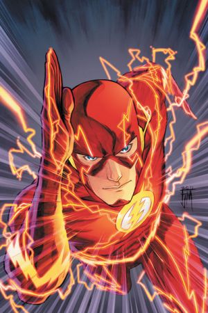
Overall, it was a decent first issue with an unfortunately weak ending. The artwork was amazing, though.
Story: 6/10
Art: 9/10
Last Updated: January 17, 2025 - 08:20
