Comics /
European Comics
Belgian Comic Book Styles: The School of Charleroi and the Ligne Claire
By Hervé St-Louis
May 30, 2009 - 10:34
Belgium is known for its absurd culture and odd sense of humour. But in the world of comic books, Belgium is best known for spearheading two “schools” that remain important to this day in the Belgian comic book scene. The two schools are the Charleroi School (also known as Marcinelle School) and the ligne Claire (also known as the Brussels School). These schools are styles that have evolved in parallel for decades and at first, opposed two comic book publishers, their star property and their cities. The Charleroi School, based in Marcinelle, Charleroi, in Belgium, was home to comic book publisher Dupuis, which published Le Journal de Spirou, the direct competitor to Le Journal de Tintin, published by Brussels’ Le Lombard. Both Spirou and Tintin were adventurers, with respective sidekicks, Fantasio, and Captain Haddock that travelled the world and fought evil. Each had a pet animal, Spip the squirrel for Spirou, and Milo the dog, for Tintin. Each was the headliner of anthologies series published by their respective publisher. However, the visual style of each series was quite different.
 |
| Spirou |
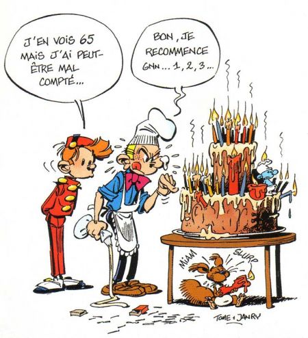
Spirou, although created by Robert Velter has had several major cartoonists working on his stories and throughout time modifying his designs and his stories. Joseph Gillain (Jijé) and André Franquin are some of the major artists that have worked on
Spirou over the course of several series. Georges Remi (Hergé) has been the creator of Tintin and his main cartoonist. However, cartoonist, Edgard Félix Pierre Jacobs (Edgar P. Jacobs) worked on the background and restyling of
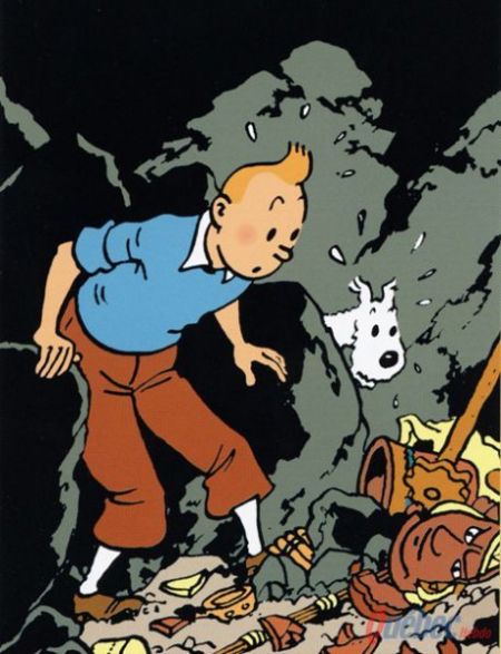
Tintin stories when they were published as albums – colour compilations containing an entire adventure of the character.
 |
| Tintin |
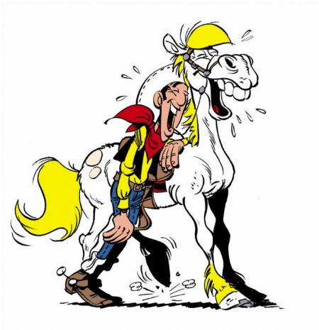
Spirou is cartoony and his lines are more chaotic. The inking serves as a means to add contrasts to characters from backgrounds and to add weight to some elements. Characters also cast inked shadows and have more than flat colours. This is the Charleroi School. It is a style shared by
The Smurfs,
Cédric,
Lucky Luke and more. One way of distinguishing the Charleroi style, are the elongated tubular legs of characters devoid of knee caps or calve bulges. Characters have more cartoonish proportions with their heads being significantly larger than they should.
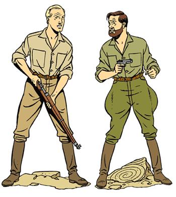
By contrast, Tintin, does not wear tight fitting jeans inked with black inks with blue highlights. He wears baggy pants with a dull shade of beige hiding the shape of his legs. His facial features are simpler. He has but dots for eyes. His head is a circle and his age is difficult to determine. Backgrounds are coloured with beautiful pastels that do not nuance the characters in the foreground. Drawn lines are all closed and of even weight. This is the ligne claire School. It’s a style shared by
Blake and Mortimer,
Alix and
Michel Vaillant.
 |
| Blake and Mortimer, by Jacobs - the other father of the ligne claire |
Charleroi styling implies a comic book intended for a younger audience or material with heavy humour themes. It’s more slapstick oriented and more dynamic in movement. However, works by French cartoonist Manu Larcenet, such as
Ordinary Victories use the Charleroi look for his stories, although it is clearly geared toward an adult audience. The ligne claire is often associated with serious stories, not necessarily adult in themes, but definitely not for small children. However, works questioning Tintin’s sexuality have proved that the ligne claire look has a type of innocence and naiveté hidden under the preposterous “serious” nature of the series.
 |
| Europe's American dream from Charleroi and Paris |
Today, the Charleroi style and the ligne claire exist in updated forms in subsequent stories of classic series like
Spirou and
Michel Vaillant. As Belgium’s comic book production is more than ever intended for an international audience and that of France, its particularities have long been adopted by French cartoonists and those elsewhere. The French comic book industry has a propensity to absorb styles and talents from all over Europe, North America, South America and Asia in a melting pot that can then be spread around back to its sources. Thus the Belgian look of comic books is no longer as important as it once was. Moreover, the more adult orientation of European comic books has made both schools look like classics next to material from Moebius, Jacques Tardi, Lewis Trondheim, Servais, Jacques Ferrandez or Vittorio Giardino.
Last Updated: January 17, 2025 - 08:20
