Games /
Game Reviews
Review: Game of Thrones - The Lost Lords

By
Sean Booker
February 23, 2015 - 21:41
After a brutal ending to the premiere episode, The Lost Lords: the second episode in this season of Game of Thrones, is a bit more of a temperate note. There aren’t many major decisions to make which causes the episode to lose some impact. The story and characters do comes through much better and allows to narrative to be easier to follow. Surrounding this is another set of odd user interface issues that make the game’s flow jarring and less than ideal. Episode two doesn’t deliver as well as its predecessor.
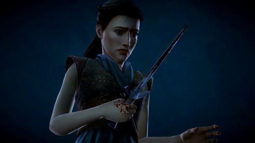
With the harsh decisions and character deaths aplenty before it, episode two just doesn’t stand up in terms of how brutal it is. It’s a much slower episode with more plot building in terms of the story. This doesn’t allow for any real shocking moments and the tough choices become quite limited. There are a couple of tense scenes but each pale in comparison to what we have come to expect. The episode comes off as slowly paced. I felt a greater lasting impression following the conclusion of episode one over The Lost Lords.
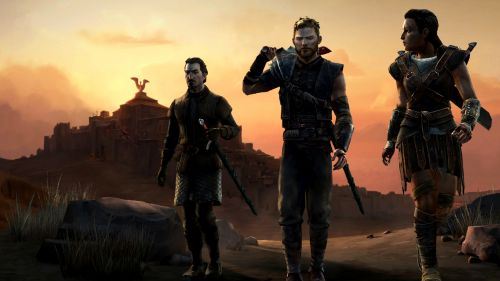
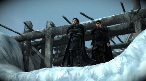
This slower progression does give more screen time to the many characters and, as a result, the narrative is easier to follow. Focusing on the plot as opposed to the action allowed me to get a better sense of all the different story arcs. Even though additional faces are introduced I had an easier time seeing everyone’s relationship to one another. However, this might simply be from a longer exposure to this universe but I’m sure the more character focused scenes helped. Episode two is definitely a low-key note that is hopefully building to something great.
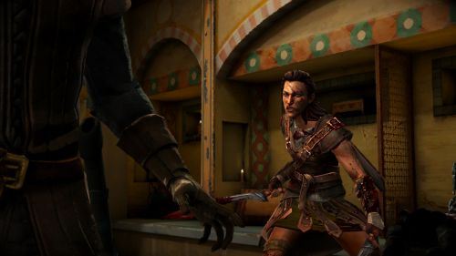
My biggest concern was seeing that some of my user-interface concerns had continued into The Lost Lords. This time around there is just an abundance of different ways the game tells you to input the quick time events. New actions require holding the button or waiting for a circle to touch the button prompt’s edges. In fact, there are multiple different visual cues for the same action the player has to take. Having two or three different ways to tell me to wait before pressing said button is a bit excessive. This often had me failing the prompts as new ones constantly surfaced, leading to quick deaths and fights that needed to be repeated. It feels like some of the user-interface needs to be streamlined a bit in order to get the useful information across.
The Lost Lords is a bit of a slow point for this season. There isn’t many truly exciting events and the moments of action are littered with weirdly designed quick time events. The story is focusing more on the characters and this allows us to better follow all the intertwining plot threads. Hopefully this focus on building up the narrative is leading to something really interesting.
Rating: 4 /
10
Last Updated: November 29, 2025 - 16:51


