- Comics
- Comics Reviews
- Manga
- Comics Reviews
- European Comics
- News
- Comics News
- Press Releases
- Columns
- Spotlight
- Digital Comics
- Webcomics
- Cult Favorite
- Back Issues
- Webcomics
- Movies
- Toys
- Store
- More
- About
By Koppy McFad
May 10, 2009 - 00:20
 |
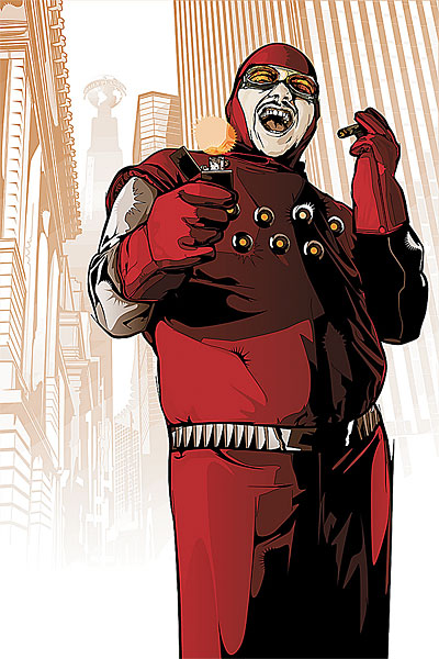
The Human Flame, the third-rate supervillain who helped kick off the Final Crisis tries to escape from his sins, making a disasterous run to evade his pursuers (both real and imagined) and in the process, makes things much, much worse for himself.
When FINAL CRISIS was first announced, it was made to look as if the Human Flame's role would have some great metaphorical or spiritual meaning-- about how he was a symbol for the human spirit. But in the end, he proved to be merely a fall guy and a puppet for the real villains.
This miniseries does not try to elevate him. He is depicted as a selfish, petty, paranoid thug who uses the few friends and loved ones he has. There is no spark of nobility in this "human flame." If anything, he has become even more brutal, believing that the world "owes" him something for all his troubles.
The creative team does their best to make us dislike him, opening the comic with the Human Flame rampaging through a hospital, injuring nurses and patients while giving us a glimpse of his hairy butt peeking through the open end of his hospital gown.
Despite having a protagonist with no sympathetic traits, this comic is lively and compelling, partly because the creators succeed in making us interested in the Human Flame's fate without really caring about him. He may be a creep and a loser but he is entertaining in the way he tries to justify his actions to himself and the way he uses his resentment against the world to motivate him. The bunch of low-lives he gets involved with, are also entertaining in their own sad/sordid way and the part when a hit-man calls him "Nipple Flame" should get a lot of laughs.
The art helps the story a lot with its intricate detail and its clear, well-defined lay-outs. Each panel is set up well, telling the story effectively, even in the scenes which take place in darkness. Who says an artist has to cover a comic book page in thick black lines to create a sense of gloom or danger? Not this comic.
There are a few glitches like Firestorm being depicted with light skin. The cover is also rather unimaginative and fails to convey any sense of the action or desperation inside the book. It looks like a bad 1960s ad for Chesterfields.
Rating: 8 /10