Comics /
Spotlight
Event Series Debut Face-Off, Part 1: Art and Design
By Dan Horn
September 10, 2013 - 15:37
So, it's late summer, and the Big Two are rolling out their heavy-hitters, their blockbusters. DC just this week unleashed
Forever Evil
and Marvel's come out of the gate with two events of its own:
Infinity
and
X-Men: Battle of the Atom. How do the three series stack up against one
another? Which is most worth its cover price? What book is most
accessible to new readers?
This week, I'm
examining these three events in a series of three articles. This is the
first part, in which we compare the books in terms of art and design.
Let's
face it: a comic book event series is only as good as its art. Like a
director's vision for his film, a personal translation of the
screenwriter's tale, the artist in any comic series (especially a summer
event) has to render his/her writer's story in an evocative and
imaginative manner. If the story's great but the art is abysmal, can we
truly say that the combined vision of the creators succeeds within a
medium that is predicated upon visual storytelling?
Recently, a lot has been made of comics journalists focusing almost
exclusively on scripting as a book's merit. It's true that that seems to
be the case. Even here at the Bin, quite a few of our reviews and
articles only inspect a comic book's art cursorily. It's certainly a
strange practice: reviewing a book that's heavy on art and light on
prose and juxtaposing the importance of art and prose in regards to the
book's allure. (Not to diminish the writer's value either; a book needs to be well-written to be remotely interesting.)
Maybe it's the reviewer's own
limited ability to engage art that keeps him from delving into and
critiquing it. But in any case, art is a difficult thing to ignore when
you're discussing event comics. In event comics, art is the main draw (no pun intended).
You know the publishers will be paying top dollar to make every page a
graphic spectacle. If nothing else, that's what an event series is for.
So, how do Forever Evil #1, Infinity #1, and X-Men: Battle of the Atom #1 fare in the art and design department?
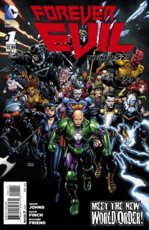
With Forever Evil, penciller David Finch, inker Richard Friend, and colorist Sonia Oback are pulling double-duty as cover and interior artists. Finch's cover for Forever Evil
#1 effectively gets the book's theme across: a horde of DC's most
iconic villains in one of the largest bad-guy team-ups we've seen since Villains
United.
Unfortunately, the issue's cover
doesn't do much else to grab your attention. It's dark without any
compelling contrast. It's workmanlike, just a collection of characters
against a black backdrop, and some of those characters are taking
awkward stances or are showcasing some sloppy detail work. There's very
little attention paid to composition here at all, but what symmetry
exists, pulling your eye to the center of this muddled collective of super-villains, is enough to
suggest that Finch isn't an amateur. Perhaps he's just exhausted.
The
title graphic is interesting enough, if a bit pedestrian. It stands out
bold and red, but it is set against the lighter value of the faded
background, which detracts considerably from some of that eye-catching
vibrance. Honestly, I wouldn't have picked this up at first glance if I
hadn't already known it was DC's "next big thing." The craggy 90's
caption at the bottom corner of the cover does nothing to salvage its
appeal.
I do have to admit to really appreciating Forever Evil's laminated cover stock. Am I the only one who gets sweaty hands while he's holding a stack of comics? (Maybe that's a personal problem.)
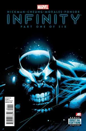
In comparison, Adam Kubert and Laura
Martin's Infinity #1 cover does a lot right. It's simple. It's clean. It
does a brilliant job of contrasting a white-hot palette with the deep,
black background. The title graphic is sleek and uncomplicated.
Infinity
#1's cover also has two things in common with Finch's aforementioned
cover piece: firstly, it gives you a general idea of what Infinity is
about, or who its central character is. This is a tribute to the clarity
of Kubert and Martin's vision.
However, its second commonality with Finch's work isn't quite so flattering. Like Forever Evil
#1, I'm not sure that Infinity #1 does much to inform the uniformed.
Sure, the cover is lustrous and crackling with energy,
but would I know what it was if I wasn't aware of the event beforehand? I
suppose the gorgeous cover would prompt an examination of the book, and
maybe that's good enough.
On the other hand,
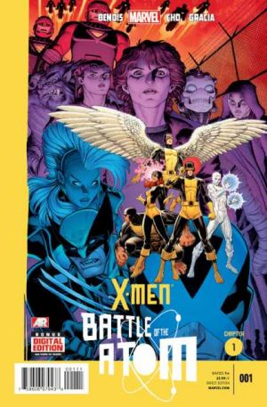
the design of the cover for X-Men: Battle of the Atom #1 let's you know
exactly where you stand. The cover has a bright yellow half-border shared by its tie-ins and subsequent installments and
clearly notes that this book is the first chapter of an arc. The title
graphic is fun and immediately grabbing, and it fits perfectly into
Arthur Adams' compositional flow.
What Adams
and Peter Steigerwald's cover illustration lacks in lucidity of premise
it certainly makes up for in depth, contrast, and spectacle. Battle of
the Atom #1 is a clinic in bold palette choices and compositional
arrangement. And come on, it's Arthur Adams drawing X-Men event covers.
The guy's a veritable virtuoso. This is what event books are all about.
In Forever Evil
#1, Finch, Friend, and Oback open the story with a truly compelling and
cinematic three-panel page. Unfortunately, "cinematic" is where Finch's
illustrations persistently live, and his dark, gritty stylings never really do much
for this debut issue, and Oback's dour palette doesn't do it any favors
either. In effect, Forever Evil #1 is overcast, murky, and ultimately visually forgettable.
Finch
and Friend really seem to struggle with consistency throughout this
book as well. There are quite a few lopsided or squashed heads in Forever Evil
#1 and some other anatomical quirks and digital overlay and shortcut
snafus to boot. The penciller and inker seem to perpetually vacillate from extreme
detail to slovenliness. The unnecessary centerfold spread in this issue
says it all: a sea of haphazardly rendered villains, dull and awkward,
wading into a chiaroscuro gloom.
While Finch and company struggled to find their footing in Forever Evil,
Infinity #1's bullpen of artists was putting together something truly
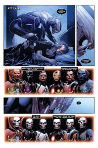
special. First, let me just say that I'm a sucker for Jonathan Hickman's
signature designs. Like many if his other series, this is a book that
you can get lost in with its charts and its clever title cards. Sure,
most of these breaks are just nearly-blank pages, but they're
integrated so immaculately in regards to story progression and
thematics that it's difficult to picture Infinity #1 without these
design features.
But Infinity's real charm
lies in its illustrations. Penciller Jim Cheung is joined by various
inkers, including Mark Morales, and colorist Justin Ponsor on this debut
issue. Cheung's drawings are superb here. His line work, with the help
of his inking corps, is crisp and his characters are dynamic and
engaging. His creature designs are incredible. If a Guillermo Del Toro
wet dream collided head-on with a Clive Barker night terror, you'd get
something similar to what Cheung has offered us here. His panel
compositions are outstanding as well, and the storytelling flows
effortlessly even where Cheung has given readers some challenging
arrangements. Every panel and every drawing is like a piece of a jigsaw
puzzle. There's great care being taken here to present something that
illustrates an encompassing creative vision.
Justin
Ponsor also has a standout performance in Infinity #1. His palette
choices are deliberate and often beautiful, and he deftly implements
that palette to create convincing transitions from chapter to chapter.
The palette itself looks remarkably like something Dean White would lay
down: there's a painterly quality to it, but that doesn't mean its
earthy and pastel tones aren't frequently shot through with
scintillating neons and crackling contrasts.
X-Men: Battle of the Atom #1 takes a different approach to the spectacle of the comic event. Whereas
Forever Evil
goes all-in on grit and
Infinity goes balls-to-the-wall on quality,
Battle of the Atom's artistic team of Frank Cho, Stuart Immonen, Wade
Von Grawbadger, and colorist Marte Gracia focus on eye-popping,
technicolor dynamism. In a way, it's a return the comic events of yore.
Interspersed with wonderfully composed and grimly colored pages by
Immonen and Gracia, the rest of the issue is vivid, electric, and
exciting.
Battle of the Atom #1 contains several splashes and panels
that are so bombastically drawn by Cho and given such brilliant life by
Gracia that I've had to go back through this book several times just to
admire it all.
Granted, there are a few low
points scattered throughout the issue. A few pages are pretty simplistic
and stand out like a sore thumb amidst the clangor of epic Sentinel
battles and sizzling eye-beams. But as a whole, this opening salvo is
just that: an optical barrage that rarely lets up long enough for you to
catch your breath.
The Verdict:
So, in terms of pure visual appeal, who wins the battle of the event debuts?
I'm going to give this one to Infinity with Battle of the Atom coming in just a hair behind and Forever Evil bringing up the rear.
Next
time, I'll consider the books by premise, scripting, and value. The
third and final installment will consider the series' tie-ins, their
quality and their importance to the main series.
Last Updated: March 3, 2025 - 20:40


