- Comics
- Comics Reviews
- Manga
- Comics Reviews
- European Comics
- News
- Comics News
- Press Releases
- Columns
- Spotlight
- Digital Comics
- Webcomics
- Cult Favorite
- Back Issues
- Webcomics
- Movies
- Toys
- Store
- More
- About
By Andy Frisk
October 3, 2009 - 22:55
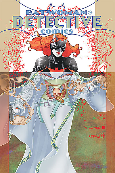
Alice’s final plans for the destruction of Gotham are executed, and Alice seems to have a personal motivation for destroying Gotham, Batwoman, and her father, who she has captive, thusly hinting at unknown ties between the three. Alice plans to unleash cyanogen chloride, which when it is inhaled or absorbed into the skin, turns into cyanide. She plans to release this toxic brew over Gotham by air. This leads to a battle aboard Alice’s plane, once Batwoman is able to air drop to it from a plane commandeered by Abbot and his crew. Just before Batwoman saves the day, her father gets a good look at Alice and recognizes something, or more aptly, someone…
 |
The pretty tired plot of the mad, mysterious, insane, and painted faced villain who’s out to destroy Gotham and is thwarted by a hero dressed as a big bat takes a minor turn towards the interesting with the conclusion of “Elegy” in Detective Comics #857. Batwoman’s first headlining adventure in Detective Comics has now concluded, and regrettably, it wasn’t anything strikingly unique or original. The revelation of Alice’s ties to Kate Kane and her father isn’t particularly original either, but it makes Alice a character that would be worth seeing again. She was simply blandly annoying up until this point.
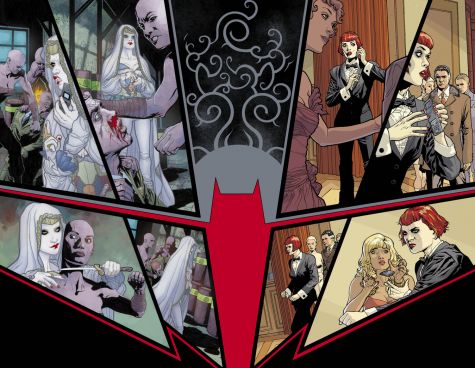
While Alice might have been an annoying and bland character until now, her look was anything but bland throughout “Elegy.” In fact, neither was Kate Kane/Batwoman’s either. JH Williams’ art is absolutely phenomenal. The incredible detail he puts into each drawing of a costume or background is stunning. His panel layouts are some of the most interesting and unique seen in any major superhero title in years. Not only do the panels uniquely lay out the action and curl and wind their way around the page like mini works of delicate and detailed art themselves, they contribute to the theme and underlying plot elements behind the story. Rarely do we see a case in mainstream superhero comics where panel layout actually contributes to the storytelling rather than just providing space for action and adventure shots. Once the reader gets the gist of the connection between Batwoman and Alice, the full two page spread of the two where they seem to mirror one another and form a sort of tilted yin and yang symbol, speaks volumes in and of itself. The layout is a masterpiece of a work and worthy of study by any aspiring graphic novelist on how to uniquely and powerfully lay out a page. When Stewart supplies the colors to these magnificent layouts, the work is complete and becomes truly inspiring.
 |
| Just one of the thematically important mirror images in the issue... |
Detective Comics is still laboring under a lack of truly original and engaging storytelling, but its artwork is so good that it the book can be read for this reason alone. Rucka is a very accomplished storyteller so hopefully Batwoman’s stories will improve. A comic book cannot survive on artwork alone.
Rating: 7 /10