- Comics
- Comics Reviews
- Manga
- Comics Reviews
- European Comics
- News
- Comics News
- Press Releases
- Columns
- Spotlight
- Digital Comics
- Webcomics
- Cult Favorite
- Back Issues
- Webcomics
- Movies
- Toys
- Store
- More
- About
By Andy Frisk
April 13, 2009 - 11:20
MOBY-DICK is considered by many to be the Great American Novel. It is a thrilling action/adventure tale to say the least and a ponderous tome of incredible depth and meaning to say the most. Any sequential art adaptation worth its sea-salt should splash down some where in between these two views of the novel, satisfying the adventure aspects as well as at least touching on the novel’s depth. Marvel Illustrated’s version, adapted by the very capable Roy Thomas, accomplishes this task quite adequately. It is though, absolutely, as Roy Thomas himself states in his introduction, “a bridge, an inspiration to seek out the original.” For those of us who have read the original, perhaps more than once even, it serves also as a bridge leading back to a rediscovery of the original novel.

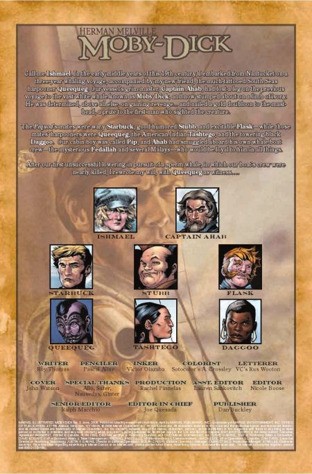
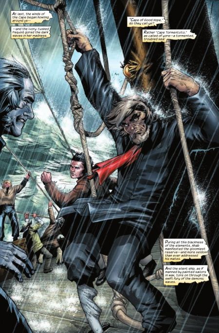
A look at the physical depictions of the novel’s most famous characters is a good place to start when discussing this adaptation. Ahab, among the most memorable characters in American Literature has been represented on film, in other sequential art adaptations and, perhaps most importantly, envisioned in the minds of literally millions of the novel’s readers. Pascal Alixe’s version of Ahab is pretty traditional yet has it own interesting details. Alixe’s Ahab is strong and stoutly built with lightly colored, or gray, hair and beard. It’s an interesting, slightly ambiguous color that doesn’t directly reflect or peg his age down. Perhaps his hair is meant to be more grayish in color since his eyebrows are jet black in sharp contrast. He wears a standard sea jacket with a red sash denoting his rank as captain but it is the scar on his face and the depiction of his sperm whale-jaw bone leg that are most striking about his appearance. His peg-leg is an unfinished bone with an uneven profile and a very rough look. It is not the polished and shapely reproduction of a human leg but rather a hastily and perhaps purposefully left rough hewn bone that reveals something, visually, about Ahab’s character. Ahab is a bent and gnarled man inside due to his encounter with Moby Dick and is twisted with rage and all consuming hate. His gnarled, unpolished, and uneven whale bone leg helps give us a clue to the twisted spirit of this man. His anguish is made physically manifest though his leg’s appearance. The scar which runs down his face is also pretty accurately portrayed as in the novel, with one major exception. In the graphic novel it appears to terminate near his upper right lip whereas in the novel, Ahab’s scar runs down his neck and disappears underneath his collar causing Ishmael to wonder whether it runs the whole length of his body like a lightening strike would run the course of an entire tree. To me this change is pretty important although small as it serves as a link to one of Melville’s inspirations for Ahab,
All of Alixe and Thomas’ renderings of the novel’s other characters reveal their natures accurately and realistically. Queequeg is the heavily tattooed, small of stature South Pacific “noble savage.” Starbuck is conservative in appearance much like his character calls for with short neat hair, no facial hair and a newer looking sea jacket than the one Ahab sports, perhaps suggesting his lesser amount of years at sea but more likely his closer attention to personal and professional upkeep of physical presentation in wardrobe and appearance, a hallmark of a mind less distracted by overwhelming emotion. Ishmael is the young, relatively and sufficiently stylishly un-kept moody youth that he is at the time of the novel’s action. The whale himself, Moby Dick, is accurately portrayed as the battle scarred, harpoon embedded, and lance bearing master of the seas.

Alixe’s renderings of the facial expressions and movements of the characters also represent the nature of each quite well. Ahab often has an angry madness about his countenance that borders on insanity, accurately depicting his inner madness and obsession with killing Moby Dick. Queequag, for all his facial and body tattooing giving him a “savage” look, nearly always maintains a serene and regal facial expression and his movements are graceful and powerful like the son of a king’s should be. Ishmael, our narrator and musing philosopher is sufficiently depicted with a wandering look upon his face as if he’s lost in thought, particularly as he is shown either ascending or descending from the mast-head of the ship, which serves as the highest point on the ship and therefore the lookout.
Alixe’s panel layouts and actions sequences capture quite well the story’s momentum towards the final showdown between Ahab and Moby Dick. The panels separating the different scenes become more irregular and uneven as the work progresses with splashes bleeding through them at some points near the end. This helps convey the breakdown of the ship, and its crew, physically and mentally as they both begin to fall victim to Moby Dick. One particular scene conveyed especially well is the one where Moby Dick bites off Ahab’s leg. It is not gory or bloody by any means and the actual moment is experienced through a harrowing panel where only Ahab’s anguished face is visible surrounded by red and black. It is a visual that defies description in words yet strikingly portrays both Ahab’s physical and psychological pain at the moment as only a graphic novel’s graphic language can.
Speaking of images that are difficult to put into words, Chapter 55 of the novel MOBY-DICK, which is not recreated in the graphic novel but bears mentioning as it is a relevant observation which helps one understand the difficulty of translating a picture into words and vice versa, Ishmael suggests that drawings that existed at his time did not accurately portray what a whale really looked like and the only way to really get a feel for the image of a whale is to see one for oneself in real life. Metaphorically, this observation can be applied to this graphic novel as it is an interpretation of a work that is nearly bottomless in its depth of meaning and serves only as a superficial rendering of the novel. One cannot relate the complexities of MOBY-DICK in graphic novel form. As mentioned though, Roy Thomas was fully aware of this fact. As he states, again in his introduction to the collected graphic novel: “In the end, I decided it was best to concentrate pretty much solely on the storyline itself-heaven’s knows there’s plenty of that!-but that didn’t stop me, while re-reading the novel, from reveling in those chapter long asides and gleaning an occasional tidbit from them that could be sandwiched into the story proper.” These “chapter long asides” are where most of the novel’s depth occurs and Thomas does do a pretty good job of bringing some of this depth in.

Unfortunately Thomas either chose or was unable to work in aspects of two of MOBY-DICK’s most powerful and philosophically important chapters, “The Whiteness of The Whale” (Chapter 42) which helps explain the sublime horror that Moby Dick, being a whale of an irregular all white color, can inspire in its visage and “The Try-Works” (Chapter 96) which reveal more of the intricacies of whaling as a well as more of Ishmael’s musings on the nature of their quest to kill Moby Dick and how it is an inversion of what should be their true purpose-the hunting of whales for profit, not the hunting of one specific whale to profit their captain’s ego. Thomas also, perhaps due to the need to include a glossary of terms that the reader might be unfamiliar with, leaves out Ishmael’s interesting but rather long collection of extracts on whales taken from several works of literature and various books on cetology “the science of whales” which opens the novel and helps set the stage for the complex and deep themes the reader would be encountering in the novel. This is a work based upon the action/adventure aspects of the novel though and the exclusion of these chapters and aspects do not detract from the purpose of this graphic novel. A brief inclusion of them would have rounded out the adaptation though.
Overall, for those of who love MOBY-DICK (as you probably can guess, if you’re still with me, as I do) Marvel Illustrated’s Roy Thomas adapted graphic novel interpretation is a worthy one and is a pleasure to read and absorb. If you’ve never read MOBY-DICK before you will still enjoy this easy to read yet completely non-juvenile adaptation. I truly feel that Thomas accomplished his goal of creating an adaptation of a grand and fascinating novel that truly will inspire readers to want to either re-read or pick up for the first time Melville’s original work. It certainly has done so for me.
Rating: 10 /10