- Comics
- Comics Reviews
- Manga
- Comics Reviews
- European Comics
- News
- Comics News
- Press Releases
- Columns
- Spotlight
- Digital Comics
- Webcomics
- Cult Favorite
- Back Issues
- Webcomics
- Movies
- Toys
- Store
- More
- About
By Colin Andersen
August 18, 2011 - 15:13
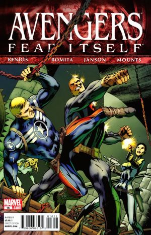
If Jeff Parker showed readers in Hulk #38 how to handle a summer event tie-in comic, then Brian Michael Bendis is showing us how not to in Avengers #16. It’s not a bad issue, per se, but it just felt out of place, though some may disagree.
The issue focuses solely on Steve Rogers as he attempts to manage his grief at his second loss of Bucky over in Fear Itself. How does someone like Captain America handle loss of a comrade? Why, by abandoning all of his duties and the chaos in America and around the world to seek revenge of course! Unfortunately, things don’t go as planned as Steve and his “Avenging Angels” find themselves up against some his most dangerous Nazi enemies.
That’s really about all there is to this issue but, despite that, it still manages to be rather confusing. The biggest problem is when this issue actually takes place: before or after Fear Itself’s story has ended. While this issue uses the same framing device of talking Avengers’ heads looking back on events as the past
 |
As bland and somewhat confusing as the story is, the worst offender is John Romita Jr’s artwork. I’m very vocal of my dislike for Romita Jr’s art from anytime in the last 15 years and Avengers #16 is no exception. It simultaneously completely ugly and boring and makes for an issue that I had to trudge through. Even worse is that large chunks of the issue are silent, making the reader rely on the art, but his work is far from good enough for this. Detail is either lacking or nonexistent, especially in backgrounds and there are multiple instances of people seeming to either not have pupils or no eyes at all. The action is boring, his women look like men in some panels and sometimes can’t even be told apart. And don’t even get me started on Cap’s “shield jump” that’s just looks like something out of a cartoon. For an issue that’s all about emotion and revenge, Romita is an especially poor choice as he has no handle on how to illustrate these and it really, seriously hurts some of the more emotional scenes and makes them almost laughable. I know there are tons of people out there that love Romita’s work and this will likely be no exception. Good for you if that’s the case, but I found this to be one of the single most visually unappealing comics I have read in a long time.
I know this likely won’t happen anytime soon, but Marvel really needs to get Bendis and Romita off of this series. Avengers is supposed to be Marvel’s big flagship title, but this team is doing way more harm than good. It is not accessible to new readers, it barely features any of the Avengers, has no immediate visual appeal and a story that falls mostly flat and is slightly confusing. Avengers deserves better and I hope to see that sometime sooner than later. In the meantime, don’t waste your money on this series, either as a single issue or in a trade paperback.
Rating: 2 /10